Chapter 1
In this chapter we will learn the principles of working with a report in the FastReport. We will also take a close look at report elements such as report pages, bands, and report objects.
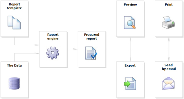
The
report building process can be represented as follows:
Report template (later-Report) - this is, what we see in the designer. Reports are saved in files with an extension .FRX. A Report can be created with the help of designer or programmatically.
Data can be any: this is data, defined in the program, or data from DBMS, for example, MS SQL. FastReport can also work with business-logic objects (later - business-objects).
Prepared Report - this is what we see in the preview window. Prepared report can be previewed, printed, saved in one of the supported formats (.doc, .xls, .pdf and others), or can be sent by email.
In order to create a report template, a report designer is used. A designer gives the user comfortable facilities for designing the report and allows previewing the report at the same time.
The report designer is the compound part of FastReport and does not depend on the development environment (for example, MS Visual Studio). If you are a software developer, you may include the report designer into your application. This will give your end-users the ability to either change the existing report or create a new one.
A window with report options can be called in the "Report|Options..." menu. You will see a dialogue window with several tabs:
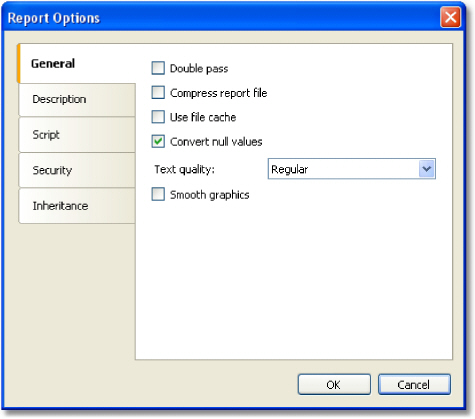
On the "General" tab, you can control the following report parameters:
"Double pass" parameter allows to enable two report passes. This can be necessary when you use the "total number of pages" system variable;
"Compress report file" parameter allows saving a report in a compressed form. For compressing, zip algorithm is used, that is why you can easily extract original contents with the help of any archive;
"Use file cache" parameter allows to save the memory when creating a report. Use this parameter if your report has got a lot of pages;
"Convert
null values" controls converting the null value data column into
the default value (0, empty string, false - depending on the
data type of a column);
"Text quality" parameter allows choosing the mode of text
displaying in the report. This mode does not affect printing
of the report;
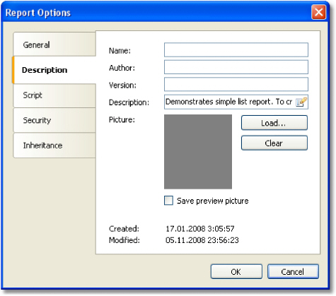
On the Description" tab, you can give the description of the report. All these parameters are not obligatory, and they serve for informational purposes:
On the "Script" tab, you can choose the script language for the report. Detailed work with script can be found in the "Script" chapter.
On the "Security" tab you can give the password which will be requested when opening the report. A report which has a password, is saved in an encoded form, so do not forget your password! Restoring a report in this case will be practically impossible.
On the "Inheritance" tab, you can control report inheritance. This functionality will be looked at later.
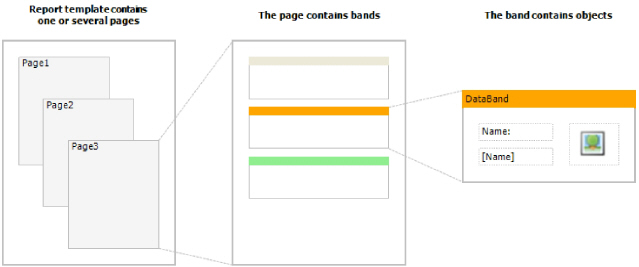
Template consists of one (mostly) or several report pages. Report page, in turn, contains bands. Report objects like Text, Picture and others are placed on the band:
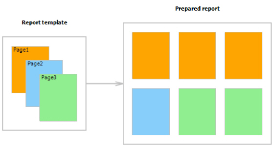
Report template can consist of several pages. For example, you can create a template containing title-page and a page with data. When creating such a report, the first page will be printed first, then the second page and so on. Every page of template can generate one or several pages of a prepared report this depends on the data it contains:
Report pages are also used when working with subreports. Contrary to other report generators, subreports in FastReport are saved in a separate template page, and not in a separate file.
Apart from report pages, a template can contain one or more dialogue forms. Dialogue forms can be used for inquiring some parameters before creating a report. Detailed work with dialogue forms will be covered in the "Dialogue forms" chapter.
When you have created a new report, it already contains
one page with several bands. For adding a new
page, click the button.
A page can also be added by clicking the
button.
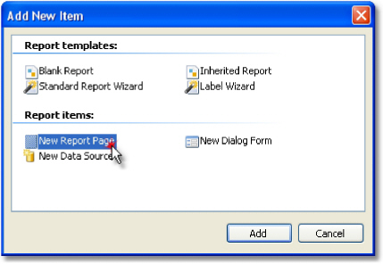
A page can also be added by clicking the  and choosing "New Report Page" in the window.
In
a similar way, dialogue forms can be added into the report. For this,
use the 
Template pages are displayed in the designer as tabs:
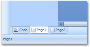
The first tab is the report code. It can neither be moved nor deleted.
In order to switch to the needed page, simply click
on its tab. Changing order of the pages can be done with the help
of the mouse. For this, left click on the tab and, without leaving the
mouse, move the tab to the desired place.
For
deleting a page, click the button. This button
is not active if the report consists of only one page.
button. This button
is not active if the report consists of only one page.
Every report page can have its own settings, such
as paper size, orientation (landscape or portrait), margins, columns,
paper source and others. Report template can contain several pages
with different orientations and paper sizes. The window with page setup
can be called  button
or by choosing the "File|Page setup..." menu item.
button
or by choosing the "File|Page setup..." menu item.
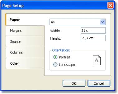
The "Paper" group allows to set the paper size and orientation. It is possible to choose one of the supported sizes, by using the drop-down list. It contains all paper sizes which are supported by the current printer.
Current printer can be configured by using "File|Printer Setup..." menu.
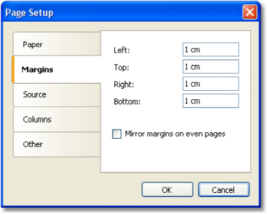
The "Margins" group allows to setup page margins. The "Mirror margins on even pages" options can be used to print booklets:
The "Source" group allows choosing the source of the paper. Note that the sources can be given separately, that of the first page of the prepared report, and that of the rest of pages:
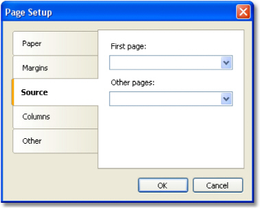
The source can be chosen in the "Print" dialog as well.
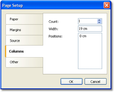
The "Columns" group allows setup the column parameters for multi-columned report. For this, the number of columns need to be indicated and (optional) correct the width of the column and the position of every column:
The "Other" group allows giving certain helpful page properties. It is possible to indicate duplex mode for duplex printing if your printer supports this mode. Here it is also possible to set the watermark, which will be printed on prepared report pages:
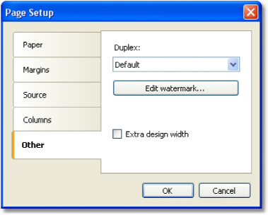
The "Extra design width" checkbox allows to increase the page width in the design mode. It may be useful if you work with such objects as "Table" or "Matrix".
The duplex mode can be chosen in the "Print" dialog as well.
The band is an object which is located directly on the report page and is a container for other objects like "Text", "Picture" and others. In all, in FastReport there are 13 types of bands. Depending on its type, the band is printed in a certain place in the report.
Band |
How it's printed |
Report Title |
It is printed once at the very beginning of the report. You can choose the order of printing - before the "Page Header" band or after it - with the help of the "TitleBeforeHeader" page property. Changing this property can be done with the help of "Properties" window. By default, property is equal to true, that is, report title is printed before page header. |
Report Summary |
It is printed once at the end of the report,
after the last data |
Page Header |
It is printed on top of every page of the report. |
Page Footer |
It is printed at the bottom of every page of the report. |
Column Header |
This band is used when printing a multi-columned report (when the number of columns indicated in the page setup > 1). It is printed on top of every column after the Page Header band. |
Column Footer |
Printed at the bottom of every column, before the Page Footer band. |
Data |
This band is connected to the data source and is printed as many times as there are rows in the source. |
Data Header |
This band is connected to the "Data" band and is printed before the first data row. |
Data Footer |
This band is connected to the "Data" band and is printed after the last data row. |
Group Header |
It is printed at the beginning of every group, when the value of the group condition changes. |
Group Footer |
It is printed at the end of every group. |
Child |
This band can be connected to any band, including another child band. It is printed immediately after its parent. |
Overlay |
Printed as a background on every report page. |
A band in the designer appears in form of a rectangular area. A band, like many other report objects, can have a border and fill (by default they are disabled). Apart from this, a band displays a grid. To set the grid mode, go the "View|Options..." menu and choose "Report page". Grid can also be enabled or disabled in the "View" menu.
You can set the band's height in three ways:
place the mouse pointer at the bottom of the band. The cursor shape will be changed to "horizontal splitter" and you can resize a band.
drag the band handle on the left ruler.
use "Properties" window to set the band's Height property.
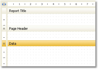
The designer has two modes of displaying bands, between which you can switch at any time. In the first mode, every band has got a header, which contains the title of the band and useful information about it (for example, the name of the data source to which it is connected).
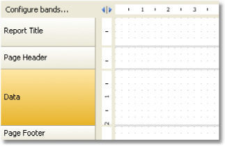
In the second mode, the band does not have a header. Instead of that, on the left side of the window, the structure of the bands is displayed. This mode helps to easily understand the structure of the report, especially if it was not created by you.
You
can switch between these modes by clicking the 
You can configure the bands in the "Configure Bands" window. It can be called from the "Report|Configure Bands..." menu or with the help of the "Configure bands" button, placed over the bands tree:
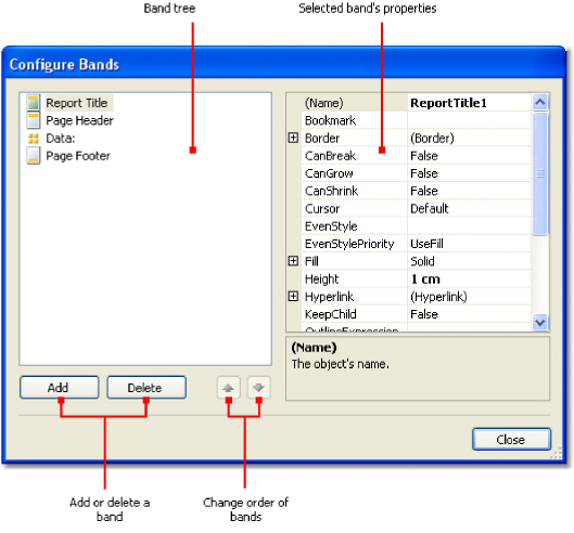
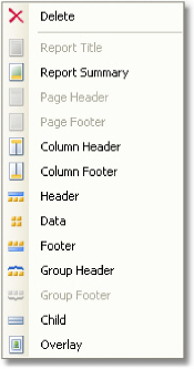
In this window, it is possible to add bands into the report, delete them or change their order. To add a band, click the "Add" button or right click on band tree. A context menu will come up containing a list of bands. A band which cannot be added is dimmed.
The "Add" operation depends on what band was chosen in the band tree. For example, adding "Data Header" and "Data Footer" bands is possible only if the "Data" band was selected beforehand.
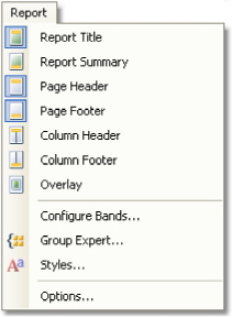
There is also another way of configuring some bands. This can be done from the "Report" menu:
To delete a band, select it and press "Delete" key.
When configuring bands, FastReport does not allow to do operations which leads to the creation of a wrong report template. For example, you cannot delete the "Data" band, which is connected to the group - for this, the group needs to be deleted first. Another example, when deleting the "Data" band, its header and footer are deleted automatically. Also, it is not possible to delete a band if it is the only one on the page.
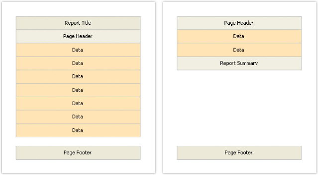
So, there are several bands placed on the page. How will FastReport compose a prepared report? Let us look at the following example:
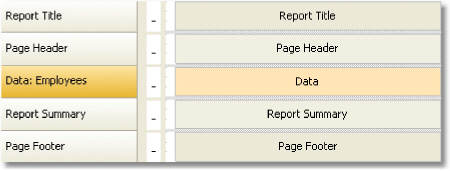
The "Report Title" band will be printed first. The "Page Header" band will be printed immediately after it. Further, the "Data" band will be printed as many times as there are rows in the data source, to which the band is connected. After all the rows of the "Data" band have been printed, the "Report Summary" band is printed and at the bottom of the page - the "Page Footer" band. Printing of the report ends with this. A prepared report will be looking something like this:
In the process of printing, FastReport checks if there is enough space on the current page of the prepared report, so that the band can be printed. If there isn't enough space, the following occurs:
page footer is printed;
a new page is added;
page header is printed;
continues to print the band which did not fit on the previous page.
Every band has several useful properties, which affect the printing process. They can be configured by using the band's context menu.To do this, right-click on an empty space on the band, not occupied by other objects. Also, it is possible by clicking on the band header (if the classic display mode is used) or on band structure (otherwise). Another method choose a band and change the corresponding properties in the "Properties" window.
Property |
Description |
CanGrow, CanShrink |
These properties determine whether a band can grow or shrink depending on the size of the objects contained in the band. If both properties are disabled, the band will always have the size specified in the designer. Read more about this in the "Report Creation" chapter. |
CanBreak |
If the property is enabled, FastReport tries to print a part of the band's contents on the available space, that is, "break" the band. Read more about this in the "Report Creation" chapter. |
StartNewPage |
Printing a band with such property begins on a new page. This property is usually used when printing groups; that is, every group is printed on a new page. |
Fundamentals |
25 |
PrintOnBottom |
A band with this property is printed at the bottom of the page, before the "Page Footer" band .This can be useful when printing certain documents, where the total sum is supposed to be printed at the bottom of the page. |
RepeatOnEveryPage |
The bands - "Data Header", "Data Footer", "Group Header" and "Group Footer" - have got this property. This type of band will be printed on each new page, when data printing is being done. Read more about this in the "Report Creation" chapter. |
A wide variety of objects can be used in a report.
Icon |
Name |
Description |
|
"Text" |
Displays one or several text lines. |
|
"Picture" |
Displays a picture. |
|
"Line" |
Displays a line. A line can be vertical, horizontal or diagonal. |
|
"Shape" |
Displays one of the geometrical shapes - rectangle, ellipse, triangle and others. |
|
"Rich Text" |
Displays a formatted text (in RTF format). |
|
"Barcode" |
Displays a barcode. |
|
"CheckBox" |
Displays a checkbox which can have two states - "Enabled" or "Disabled". |
|
"Table" |
Displays a table containing rows, columns and cells. |
|
"Matrix" |
Displays a matrix (also known as "Cross- tab"). |
|
"Chart" |
Displays a chart. |
|
"Zip Code" |
Displays a zip code. |
|
"Cellular Text" |
Displays each character of a text in its individual cell. |
An object can be used to display an information ("Text" object) or to improve the report appearance ("Picture", "Line", "Shape" objects). Complex objects like "Table" and "Matrix" can contain other simple objects.
All report objects are inherited from one basic class (ReportComponentBase) and have got certain set of common properties. Before studying each object, we will look at these properties.
You can change the value of properties with the help of the "Properties" window. Some properties can be changed using the object's context menu or toolbars (for example, border and fill).
Property |
Description |
Left, Top, Width, Height |
A report object, as a rule, is a rectangle. It has coordinates (properties Left, Top) and size (properties Width, Height). |
Anchor |
This property determines how the object will be changing its position and/or its size when the container on which it is laying grows or shrinks. By using Anchor, it can be done in such a way that, the object expands or moves synchronously with container. Read more about this property in the "Dynamic layout" chapter. |
Dock |
This property determines on which side of the container the object will be docked. Read more about this property in the "Dynamic layout" chapter. |
Border, Fill |
These properties control the object's border and fill. They can be changed using the "Border and Fill" toolbar. |
CanGrow, CanShrink |
These properties allow fitting the height of the object in such a way that it fits the whole text. Read more about this property in the "Dynamic layout" chapter. |
ShiftMode |
An object, whose property is enabled, will be moving up and down, if the object above on can either grow or shrink. Read more about this property in the "Dynamic layout" chapter. |
GrowToBottom |
An object, whose property is enabled, will be stretched to the bottom of a band. Read more about this property in the "Dynamic layout" chapter. |
CanBreak |
Objects "Text" and "Rich Text" have this property. It determines whether the object's contents can be broken into parts. |
PrintOn |
This property determines on which pages the object can be printed. Read more about this property in the "Booklet-type report" chapter. |
Cursor |
This property determines the type of mouse cursor when it is located over an object. The property works only in the preview window. |
Visible |
This property determines whether the object will be displayed in the report. Invisible object is never displayed in the preview window and is never printed on the printer as well. |
Printable |
This property determines whether the object will be printed on the printer. If this property is disabled, then the object will be visible in the preview window but it will not be printed. |
Hyperlink |
This property makes it possible to make the report object interactive. Read more about this property in the "Interactive reports" chapter. |
Bookmark |
This property is used together with the "Hyperlink" property. It can contain any expression. The expression will be calculated when the report will be working, and its value will be used as bookmark's name. |
Restrictions |
This property restricts certain operations, such as moving, resizing, deleting the object. |
Style |
You can assign the style name to this property. When this is done, the object will become like it has been indicated in the style. If the parameters of the style changes, the appearance of the object changes as well. |
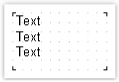
The "Text" object is the main object which you will use often. It looks like this:
The object can display any text data, specifically:
one or several text lines;
data columns;
report parameters;
total values;
expressions;
any combination of the above items.
In order to edit an object's text, just double click on it. You will see a text editor:
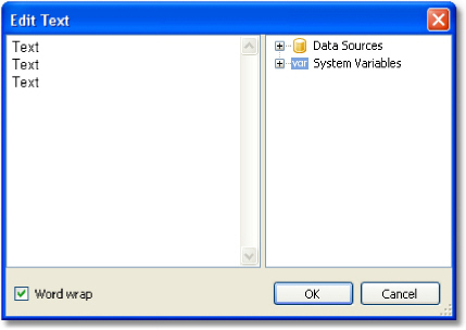
There is a data tree on the right side of the editor, which elements can be added into the text. This can be done by dragging the element onto needed place by using the mouse. Another way to insert an element into the text - double click on the element, and it will be added onto the cursor's current position.
In order to save the changes and close the editor window, click the OK button or press the Ctrl+Enter keys.
Another method of editing a text - in-place editing. To do this, select the "Text" object and press Enter. To finish editing, click somewhere outside the objects bounds or press Ctrl+Enter. Press Esc key to cancel the changes.
When editing an object in-place, its size can be changed by using a mouse.
The "Text" object can contain a plain text mixed with expressions. For example:
Today is [Date]
When printing such an object, all expressions contained in the text will be calculated. So the result may look like this:
Today is 12.09.2010
As seen, expressions are identified by square brackets. This is set in the "Brackets" property, which by default contains the string "[,]".When needed, you can use a different set of symbols, for example "<,>", or "<!,!>". In the last case, an expression in the text will be like this:
Today is <!Date!>
Apart from this, it is possible to disable all expressions. To do this, set the AllowExpressions property to false. In this case the text will be shown "as is".
Inside the square brackets, you can use any valid expression. Read more about expressions in the "Expressions" chapter. For example, an object with the following text:
2 * 2 = [2 * 2]
will be printed like this:
2 * 2 = 4
Frequent mistake - attempt to write an expression outside the square brackets. Reminding, that it is considered an expression and gets executed only that, which is located inside square brackets. For example:
2 * 2 = [2] * [2]
This text will be printed this way:
2 * 2 = 2 * 2
There may be elements inside an expression that needs own square brackets. For example, it may be a reference to a system variable (see the "Expressions" chapter for details). Let's look at the following example:
The next page: [[Page] + 1]
The text contains an expression [Page] + 1. Page is a system variable which returns the number of the current report page. It is included in own brackets. These brackets must be square brackets, regardless of the "Text" object settings.
Strict speaking, we were supposed to use two pairs of square brackets when using the "Date" system variable in the examples above:
Today is [[Date]]
However FastReport allows to leave out unnecessary pair of brackets if there is only one member in an expression.
You can print the data column in the following way:
[Datasource name.Column name]
As you can see, the square brackets are used here. The data source name and data column name are separated by the period. For example:
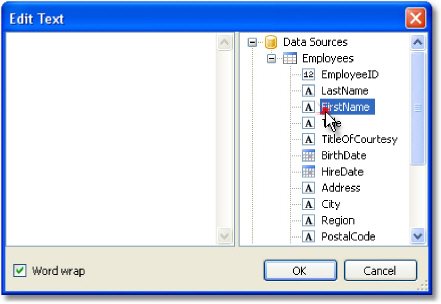
[Employees.FirstName]
Read more about using the data columns in the "Expressions" chapter.
There are several ways to insert a data column into the "Text" object.
In the "Text" object's editor we write the name of the data column manually. This method is the most inconvenient as it is easy to make a mistake.
In the object's editor we choose the needed data column and drag&drop it into the text:
Click on the small button in the upper right corner of the object and choose the data column from a list:
Drag&drop a data column from the "Data" window into the report page. In this case the "Text" object is created which contains a link to the column.
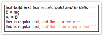
You may use some simple HTML tags in the "Text" object. By default, tags are disabled; to enable it, go "Properties" window and set the "HtmlTags" property to true. Here is a list of supported tags:
Tag |
Description |
<b>...</b> |
Bold text. |
<i>...</i> |
Italic text. |
<u>...</u> |
Underlined text. |
<strike>...</strike> |
Strikeout text. |
<sub>...</sub> |
Subscript. |
<sup>...</sup> |
Superscript. |
<font color=...>...</font> |
Font color. The color may be either the named color (such as DarkGray), or a hexadecimal code in the #RGB format, for example #FF8030. |
The following examples demonstrate how these tags can be used.
text <b>bold text</b> <i>text in italic</i> <b><i>bold and in italic</b></i> E = mc<sup>2</sup>
A<sub>1</sub> = B<sup>2</sup>
this is regular text, <font color=red>and this is a red one</font> this is regular text, <font color=#FF8030>and this is an orange one</font>
This text will be displayed in the following way:
Property |
Description |
AllowExpressions |
This property allows to turn on or off the expression handling. It is on by default. |
Angle |
This property indicates the text rotation, in degrees. |
AutoShrink |
This property allows to shrink the font size or font width automatically to fit the text. |
AutoShrinkMinSize |
This property determines the minimum size of a font, or the minimum font width ratio, if the AutoShrink property is used. |
AutoWidth |
This property allows to calculate the width of object automatically. |
Brackets |
This property contains a pair of symbols that designate an expression. |
BreakTo |
With this property you can organize the text flow from one text object to another. For example, we have "A" and "B" text objects. The "A" object contains the long text that does not fit in the object's bounds. You can set the A.BreakTo to B, so the "B" object will display the part of text that does not fit in "A". |
Clip |
This property determines whether it is necessary to clip a text outside of object's bounds. It is on by default. |
Duplicates |
This property determines how the repeated values will be printed. Read more about this property in the "Formatting" chapter. |
FirstTabOffset |
This property determines the offset of the first TAB symbol, in pixels. |
FontWidthRatio |
Use this property to make the font wider or narrower. By default the property is set to 1. To make the font wider, set the property to value > 1. To make the font narrower, set the property to value between 0 and 1. |
HideValue |
This property is of string type. It allows to hide values that are equal to the value of this property. Read more about this property in the "Formatting" chapter. |
HideZeros |
This property allows to hide zero values. Read more about this property in the "Formatting" chapter. |
Highlight |
This property allows to setup the conditional highlight. Read more about this in the "Formatting" chapter. |
HorzAlign, VertAlign |
These properties determine the text alignment. |
HtmlTags |
Allows simple HTML tags in the object's text. Read more about this property in the "HTML tags" chapter. |
LineHeight |
This property allows to explicitly set the height of a text line. By default it is set to 0, so the default line spacing is used. |
NullValue |
The text that will be printed instead of a null value. You also need to uncheck the "Convert null values" option in the "Report/Options..." menu. |
Padding |
This property allows to setup the padding, in pixels. |
RightToLeft |
This property indicates whether the text should be displayed in right-to-left order. |
TabWidth |
This property determines the width of the TAB symbol, in pixels. |
Text |
This property contains the text of the object. |
TextFill |
This property determines the text fill. Use this property editor to choose between different fill types. |
Trimming |
This property determines how to trim the text that does not fit inside the object's bounds. It is used only if the "WordWrap" property is set to false. |
Underlines |
This property allows to display a graphical line after each text line. This property can be used only if the text is top-aligned. |
WordWrap |
This property determines whether it is necessary to wrap a text by words. |
Wysiwyg |
This property changes the display mode of the "Text" object to match the screen and the final printout. This mode is also used if you use the justify-align or non-standard line height. |
This object displays the formatted text (in the RTF format). It looks like this:
Try to use the "Text" object to display a text. When you export the report to some document formats, the "Rich Text" object will be exported as a picture.
This object supports only the solid fill type. Gradient, hatch, glass fills are not supported.
To edit the object, double click on it. You will see the editor window:
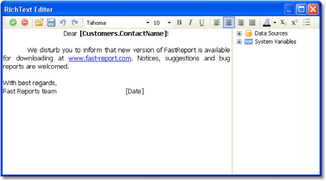
You
can also use the Microsoft Word to create a text. When you have done,
save the text in the .RTF format. Next, you need to open the "Rich
Text" editor and load the .RTF file into it by 
The "Rich Text" object does not support all of the Microsoft Word formatting features.
You can display a data in this object the following ways:
you can insert an expression in the object's text, just as you do this in the "Text" object. Insert the necessary data column into the text;
use the "DataColumn" property to bind the object to the column.
The object has the following properties:
Property |
Description |
AllowExpressions |
This property allows to turn on or off the expression handling. It is on by default. |
Brackets |
This property contains a pair of symbols that designate an expression. |
DataColumn |
The data column that this object is bound to. |
Text |
This property contains the RTF text. |
Padding |
The padding, in pixels. |
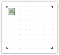
An object can display graphics in the following formats: BMP, PNG, JPG, GIF, TIFF, ICO, EMF, WMF. With the help of the "Picture" object, you can print your company logo, a photo of employee or any graphical information. The object looks like this:
An object can show data from the following sources:
Source |
Description |
File with a picture |
Picture is loaded from a file and is saved inside the report. Picture is stored in the "Image" property. |
Data column |
Picture from a data column. Name of the column is stored in the "DataColumn" property. |
File name |
Picture is loaded from a file with the given name. Name of file is stored in the "ImageLocation" property. Picture is never stored inside the report. You should distribute the picture file along with the report. |
URL |
Picture is loaded from the internet every time the report is created. Image is never stored inside the report. URL is stored the in the "ImageLocation" Property. |
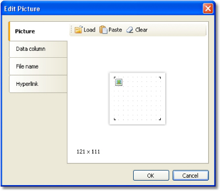
In order to call a picture editor, double click on the object. In the editor, you can choose the data source for the picture:
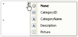
In order to bind the object to a data column, click on the small button in the upper right corner of the object and choose the data column from a list:

You also can drag&drop a data column from the "Data" window into the report page. In this case the "Picture" object is created which contains a link to the column. The column you drag should have the "byte[]" data type.
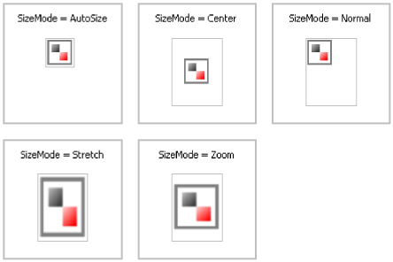
In the context menu of the "Picture" object you can choose the size mode:
AutoSize. The object gets the size of the picture.
CenterImage. The picture is centered inside the object.
Normal. The picture is displayed in the left corner of the object.
StretchImage. The picture is stretched to the size of the object.
Zoom. The picture is stretched to the size of the object in accordance with the aspect ratio.
The difference between modes is shown in the following picture:
The "Picture" object has the following properties:
Property |
Description |
Angle |
The rotation angle, in degrees. Possible values for this property are 0, 90, 180, 270. |
SizeMode |
The size mode. |
Transparency |
The degree of transparency of the pictures. The property can have values between 0 and 1. The value 0 (by default) means that the picture is opaque. |
TransparentColor |
The color which will be transparent when displaying the picture. |
Image |
The picture. |
DataColumn |
The data column that this object is bound to. |
ImageLocation |
This property can contain name of the file or URL. The picture will be loaded from this location when building the report. |
Padding |
The padding, in pixels. |
ShowErrorImage |
Shows the •No picture” picture, in case when the picture is empty. This property makes sense to use if the picture is downloaded from the Internet. |
The "Line" object can display horizontal, vertical or diagonal line. The object is as follows:

If possible, use the object's border instead of "Line" object. This will simplify the report and avoid possible problems with the export to different formats.
FastReport
designer has convenient tools for drawing a line. In order to insert a
line into a report,
click the  button
on the "Objects" toolbar and in the menu choose the "Line"
object or "Diagonal Line". Place the mouse cursor at the location
where the line will start from. Then left click and hold the mouse,
in order to draw the line. After this, you can draw the line again.
button
on the "Objects" toolbar and in the menu choose the "Line"
object or "Diagonal Line". Place the mouse cursor at the location
where the line will start from. Then left click and hold the mouse,
in order to draw the line. After this, you can draw the line again.
When
all the lines have been drawn, click on the  button
on the "Objects" toolbar.
button
on the "Objects" toolbar.
An ordinary line differs from a diagonal line in that you can make it only vertical or horizontal.
Do not choose the "Double" line style for this object. This style applies only to the object's border.
The "Line" object has the following properties:
Property |
Description |
| Diagonal | The property determines weather the line is diagonal. An ordinary line can be turned into a diagonal one by enabling this property. |
| StartCap, EndCap | These properties allow to setup the line caps. You can use one of the following cap styles:
Size of the cap can be set in the Width, Height properties of the cap. You can configure caps for each end of the line. |
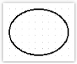
The "Shape" object displays one of the following shapes:
rectangle;
rounded rectangle;
ellipse;
triangle;
diamond.
The object is as follows:
In
order to insert a shape into the report, click the button
on the "Objects" toolbar and choose
the needed shape type.
button
on the "Objects" toolbar and choose
the needed shape type.
The shape, like any other report object, has a fill and border. Contrary to the "Text" object, you cannot control each border line. Also, don't use the "Double" line style.
Instead of rectangular shape, use the object's borders if possible.
The "Shape" object has the following properties:
Property |
Description |
Shape |
This property determines the type of shape. |
Curve |
This property is used with the "RoundRectangle" shape. It allows to set the curve. |
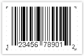
The object displays barcodes in the report. It looks like this:
The object supports the following types of barcodes:
Code |
Length |
Allowed symbols |
2 of 5 Interleaved |
0-9 |
|
2 of 5 Industrial |
0-9 |
|
2 of 5 Matrix |
0-9 |
|
Codabar |
0-9, -$:/.+ |
|
Code128 |
128 ASCII chars |
|
Code39 |
0-9,A-Z, -. *$/+% |
|
Code39 Extended |
128 ASCII chars |
|
Code93 |
0-9,A-Z, -. *$/+% |
|
Code93 Extended 128 ASCII chars
EAN8 |
8 |
0-9 |
EAN13 |
13 |
0-9 |
MSI |
0-9 |
|
PostNet |
0-9 |
|
UPC A |
12 |
0-9 |
UPC E0 |
6 |
0-9 |
UPC E1 |
6 |
0-9 |
2-Digit Supplement |
2 |
0-9 |
5-Digit Supplement |
5 |
0-9 |
PDF417 |
any |
|
Datamatrix |
any |
|
QR code |
any |
|
A detailed description of different barcode types can be found in the internet, for example, here: http://www.barcodeisland.com
Barcode data in an object is of a string type. The string can contain any symbol, allowed for the chosen type of barcode. You can choose the type of barcode in the context menu of the "Barcode" object.
You can connect an object to data by using one of the following methods:
set the barcode data in the "Text" property;
bind the object to a data column using the "DataColumn" property;
set the expression that returns the barcode data in the "Expression" property.
The "Barcode" object has the following properties:
Property Barcode |
Description This property contains barcode-specific settings. Expand this property to set these settings. |
Angle |
This property determines the rotation of a barcode, in degrees. You can use one of the following values: 0, 90, 180, 270. |
Zoom |
This property allows to zoom a barcode. It is used along with the "AutoSize" property. |
AutoSize |
If this property is on, the object will stretch in order to display a whole barcode. If this property is off, the barcode will stretch to object's bounds. |
ShowText |
This property determines whether it is necessary to show the human-readable text. |
DataColumn |
The data column which this object is bound to. |
Expression |
The expression that returns the barcode data. |
Text |
The barcode data. |
Padding |
The padding, in pixels. |
The following properties are specific to the barcode type. To change them, select the barcode, go "Properties" window and expand the "Barcode" property.
Property WideBarRatio |
Description This property is specific to all linear barcodes. It determines the wide-to-narrow bar ratio. For most of barcode types, the value for this property should be between 2 and 3. |
|
CalcCheckSum |
This property is specific to all linear barcodes. It determines whether is necessary to calculate the check sum automatically. If this property is off, you should provide the check digit in the barcode data. |
|
AutoEncode |
This property is specific to the Code128 barcode. This code has three different encodings - A, B, C. You should either set the encoding explicitly in the barcode data, or set this property to true. In this case the encoding will be chosen automatically. Use the following control codes in the barcode data: |
|
Code |
Meaning |
|
&A; |
START A / CODE A |
|
&B; |
START B / CODE B |
|
&C; |
START C / CODE C |
|
&S; |
SHIFT |
|
&1; |
FNC1 |
|
&2; |
FNC2 |
|
&3; |
FNC3 |
|
&4; |
FNC4 |
|
If you set the "AutoEncode" property to true, all control codes will be ignored. Example of use the control codes: &C;1234&B;ABC |
||
AspectRatio |
This property is specific to the PDF417 barcode. It determines the height-to-width aspect ratio and is used to calculate the barcode size automatically (in case the "Columns" and "Rows" properties are not set). |
|
CodePage |
This property is specific to the PDF417
and Datamatrix barcode. It determines the code page which is used
to convert non-ASCII |
Columns, Rows |
These properties are specific to the PDF417
barcode. They determine the number of columns and rows in a barcode.
If both properties are set to 0, the size of the barcode will
be calculated automatically. In this case the "AspectRatio"
property is used as |
CompactionMode |
This property is specific to the PDF417 barcode. It determines the PDF417 data compaction mode. |
ErrorCorrection |
This property is specific to the PDF417 barcode. It determines the error correction level. |
PixelSize |
This property is specific to the PDF417 barcode. It determines the size of barcode element, in screen pixels. As a rule, the element's height should be greater than the element width by 3 times or more. |
Encoding |
This property is specific to the Datamatrix barcode. It determines the Datamatrix data encoding. |
PixelSize |
This property is specific to the Datamatrix barcode. It determines the size of barcode element, in pixels. |
SymbolSize |
This property is specific to the Datamatrix barcode. It determines the size of barcode symbol. |
The object displays the checkbox in the report. It looks as follows:

The object can display two states: "Checked" and "Unchecked". Use the following ways to handle the object's state:
set the state in the "Checked" property;
bind the object to a data column using the "DataColumn" property; set the expression that returns the true or false in the "Expression" property.
The "CheckBox" object has the following properties:
Property |
Description |
CheckedSymbol, |
These properties determine the symbol that is shown in the object, depending on the object's state. |
CheckColor |
This property determines the color of the check symbol. |
CheckWidthRatio |
Use this property to set the check width ratio. The width of the check symbol depends on the size of the object. You can |
use values in the 0.2 - 2 range.
HideIfUnchecked |
This property allows to hide the object if it is unchecked. |
Checked |
This property controls the state of the object. |
DataColumn |
The data column which this object is bound to. The type of column should be either bool or int. |
Expression |
The expression that returns the true or false. |
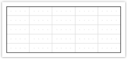
The "Table" object is made up of rows, columns and cells. It is a simplified analog of Microsoft Excel table. It looks like this:
You can learn more about this object in the "Creating reports" chapter.
The "Table" object has the following properties:
Property |
Description |
ColumnCount |
Use this property to quickly set the number of columns. If columns in a table are few, they get added, and when they are more, they get deleted. |
RowCount |
Use this property to quickly set the number of rows. If rows in a table are few, they get added, and when they are more, they get deleted. |
FixedColumns |
The property determines how many columns in the table are fixed. Fixed columns form the table header. Printing of the header is controlled by the "RepeatHeaders" property. |
FixedRows |
The property determines how many rows in the table are fixed. Fixed rows form the table header. Printing of the header is controlled by the "RepeatHeaders" property. |
RepeatHeaders |
The property allows printing the table header on every new page. This property works only for tables which are formed dynamically. |
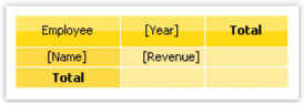
The "Matrix" object is, like the "Table" object, made up of rows, columns and cells. At the same time, it is not known beforehand how many rows and columns will be in the matrix - this depends on the data to which it is connected.
The object looks like this:
You can learn more about this object in the "Creating reports" chapter.
The "Matrix" object has the following properties:
Property |
Description |
| RepeatHeaders | If matrix is divided on several pages, this property allows printing matrix header on each new page. |
| CellsSideBySide | This property determines how matrix cells will be located if the matrix has several data cell levels. Possible variants:
|
| Style | Using this property you can set a style for the whole matrix. You can choose one from predefined styles. |
| AutoSize | This property allows to calculate the matrix size automatically. Disable it if you want to control the object size manually. |
| DataSource | The property allows connecting the matrix to the data source. This property is set up automatically when you drag data column to the matrix. However, if you use expressions in cells,check that this property was set up correctly. |
| Filter | This property contains expression for data filtering which will be applicable to data source of the matrix (see "DataSource" property). |
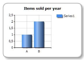
The "MS Chart" object allows to display charts. There are more than 30 different series types available - bars, columns, areas, lines, bubbles, pie, circular, financial, pyramidal, ranges. The object looks like this:
You can learn more about this object in the "Report creation" chapter.
The "Chart" object has the following properties:
Property |
Description |
Chart |
Reference to Microsoft Chart object. |
AlignXValues |
This property allows to align X values in different chart series (by inserting empty values). It is used if the chart contains two series or more. |
AutoSeriesColumn, |
These properties allows to set up automatically created series. Read more about this in the "Report creation" chapter. |
DataSource |
The property allows connecting the chart to the data source. |
Filter |
This property contains expression for data filtering which will be applicable to data source of the chart (see "DataSource" property). |
The "Zip Code" object allows to print a zip code on envelopes. It may display numeric characters (0-9).
The object is as follows:

You can connect an object to data by using one of the following methods:
set the zipcode data in the "Text" property;
bind the object to a data column using the "DataColumn" property;
set the expression that returns the zipcode data in the "Expression" property.
The "Zip Code" object has the following properties:
Property |
Description |
SegmentCount |
The number of segments in a code. This property
is set to 6 by |
SegmentWidth, |
The size of a single code segment. The default size is 0.5afii100871cm. |
Spacing |
This property determines a distance between two segment's origins. The default value is 0.9cm. |
ShowGrid |
Determines whether it is necessary to display a grid. |
ShowMarkers |
Determines whether it is necessary to display the markers (bold horizontal lines above the zipcode). |
DataColumn |
The data column which this object is bound to. |
Expression |
The expression that returns the zipcode data. |
Text |
The text containing a zipcode. |
This object can display each character of a text in its individual cell. It is often used to print some forms in financial applications.
The object is as follows:
In fact, this object is directly inherited from the "Text" object. You may connect it to data in the same manner. For example, you may invoke the object's editor and type the following text:
[Employees.FirstName]
The "Cellular Text" object has the following properties:
Property |
Description |
CellWidth, CellHeight |
These properties determine the size of a single cell. If both properties are 0 (by default), the cell size will be calculated automatically, depending on the font used. |
HorzSpacing, VertSpacing |
These properties determine the horizontal and vertical gap between adjacent cells. |
Your first report in the FastReport
Let us create a simple report, which prints a list of products. We will use the Products table, which can be found in the demo data base as our data source.
Assuming that, you will be performing the actions written below in the demonstration program, Demo.exe, from which the report designer can be called.
Example 1. Creating a report manually
In this example, we will create a report manually. For this, we will do the following:
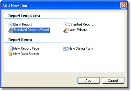
press
the button on the toolbar,
and in the "Add New Item" window, choose "Blank report";
in the
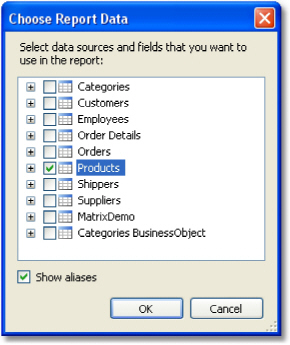
"Data" menu, choose the "Choose Report Data..." item
and check the "Products" data source:
button on the toolbar,
and in the "Add New Item" window, choose "Blank report";
in the
"Data" menu, choose the "Choose Report Data..." item
and check the "Products" data source:
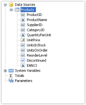
switch to the "Data" service window (if it is not on the screen, it can be shown by choosing the "Data|Show Data Window" menu item). Expand the "Data Sources" item, then the "Products" item:
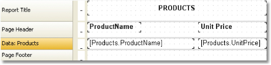
drag the "ProductName" data column
onto the "Data" band. FastReport creates a "Text" object,
which is connected to this column and a header for it;
we will create the "UnitPrice" data column by using another method. For this, press the "Text" button on the "Objects" toolbar:
leave the mouse and drag its pointer onto the "Data" band - you will see that FastReport offers to insert an object. Choose the needed position and click the mouse to insert the object;
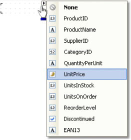
place the mouse pointer on the object and click the small button in the right corner of the object. You will see a list of data columns. Choose the "UnitPrice" item from the list:
create
the "Text" object - header for the "UnitPrice" column.
Place in on the "Page Header" band. Double click the object
and write the text "Unit Price";
create the "Text" object - report title. Place it on the "Report
Title" band and write the text "PRODUCTS";
set
"Bold" as font style for all objects that are placed on the
"Page Header" and "Report Title" bands.
For this, select objects by pressing Shift, and press the  toolbar. After
this, the report will be looking like this:
toolbar. After
this, the report will be looking like this:
In
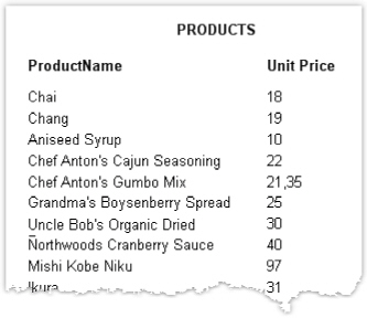
order to run the report, click the  button on the toolbar. The report will be
built and shown in the preview window:
button on the toolbar. The report will be
built and shown in the preview window:
Example 2. Creating a report with the wizard
In this example, we will create a report with the help of the "Standard Report Wizard". For this, do the following:
press
the button on the toolbar
and in the "Add New Item" window, choose "Standard Report
Wizard":
button on the toolbar
and in the "Add New Item" window, choose "Standard Report
Wizard":
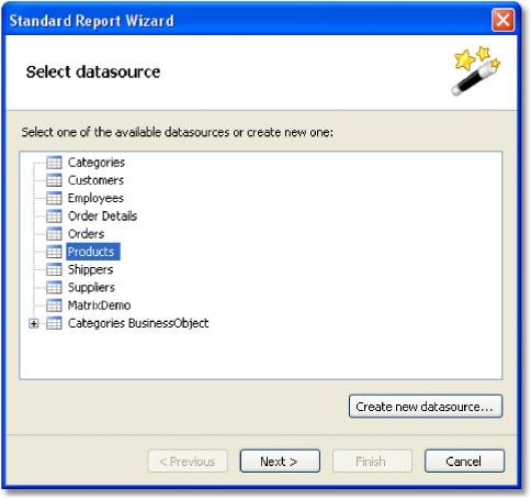
on the first step of the wizard, choose the "Products" table and click the "Next" button:
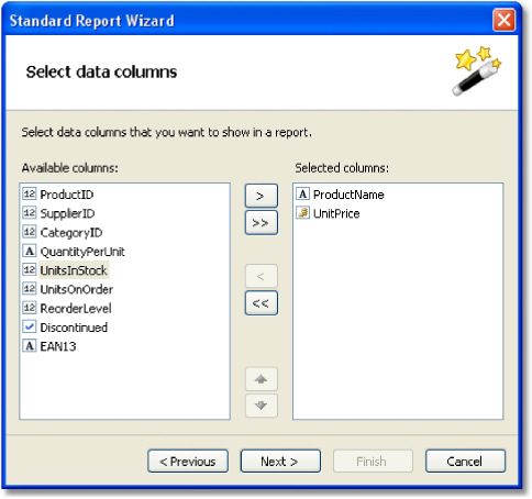
on the second step of the wizard, choose the "ProductName" and "UnitPrice" data columns:
the rest of the steps can be skipped, click the "Next" button;
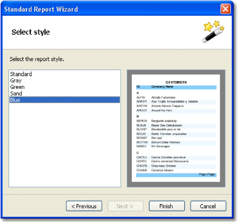
on the last step of the wizard, choose "Blue" style and click the "Finish" button:
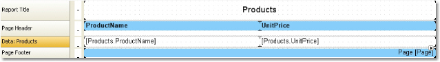
FastReport will create the following report:
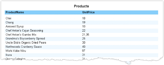
To
run a report, click the  button
on a toolbar. The report will be built and shown in the preview window:
button
on a toolbar. The report will be built and shown in the preview window: